Parallel coordinates plot of row data for each column in a matrix
Source:R/plot-parallel.R
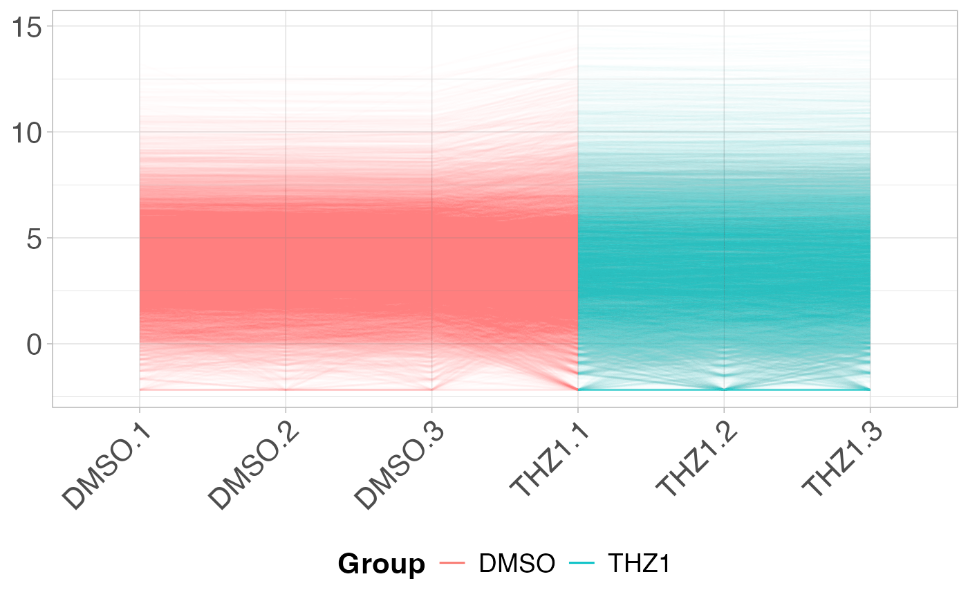
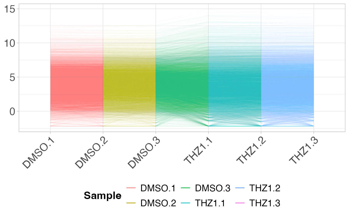
plot_parallel.RdThe parallel coordinates plot will display a line plot showing the expression value for gene on the y-axis by each sample on the x-axis.
Usage
plot_parallel(x, ...)

# Default S3 method
plot_parallel(x)

# S3 method for class 'matrix'
plot_parallel(x, metadata = NULL, colBy = NULL, removeVar = NULL, ...)

# S3 method for class 'data.frame'
plot_parallel(x, metadata = NULL, colBy = NULL, removeVar = NULL, ...)

# S3 method for class 'SummarizedExperiment'
plot_parallel(x, assay = "counts", colBy = NULL, removeVar = NULL, ...)
Arguments
- x
gene by sample matrix or
SummarizedExperimentobject- ...
Additional parameters passed to
ggplot2::geom_line()- metadata
data.frame containing metadata per sample. rownames of metadata
- colBy
metadata column used to color lines. Default NULL, every sample will get its own color.
- removeVar
Remove this proportion of features based on the variance across rows. Default NULL, all features are plotted.
- assay
assay of
SummarizedExperimentobject to be plotted. Default "counts".
Examples
# Create metadata for plotting
metadata <- data.frame(row.names = colnames(GSE161650_lc))
metadata$Group <- rep(c("DMSO", "THZ1"), each = 3)

# Plot the PCP for each sample -- passing alpha value to geom_line()
plot_parallel(GSE161650_lc, alpha = 0.01)


# Plot the PCP by coloring each sample by Group from metadata
plot_parallel(GSE161650_lc, metadata, colBy = "Group", alpha = 0.01)
# Plot the PCP by coloring each sample by Group from metadata
plot_parallel(GSE161650_lc, metadata, colBy = "Group", alpha = 0.01)