library(edgeR)

# Load in SummarizedExperiment from previous module
se <- readRDS("/path/to/03_RNAseq_counts/se.rds")

# Convert to a DGEList to be consistent with above steps
y <- SE2DGEList(airway)Differential Expression Analysis
Welcome! In this tutorial, we’ll walk through the common steps of differential expression analysis.
Library QC
Before we perform differential expression analysis it is important to explore the samples’ library distributions in order to ensure good quality before downstream analysis. There are several diagnostic plots we can use for this purpose implemented in the coriell package. However, first we must remove any features that have too low of counts for meaningful differential expression analysis. This can be achieved using edgeR::filterByExpr().
If you’d like to use your data from the previous module please follow accordingly
For this module I will be using the airway dataset
# Load the SummarizedExperiment object
data(airway)

# Set the group levels
airway$group <- factor(airway$dex, levels = c("untrt", "trt"))

# Convert to a DGEList to be consistent with above steps
y <- SE2DGEList(airway)

# Determine which genes have enough counts to keep around
keep <- filterByExpr(y)

# Remove the unexpressed genes
y <- y[keep,,keep.lib.sizes = FALSE]
At this stage it is often wise to perform library QC on the library size normalized counts. This will give us an idea about potential global expression differences and potential outliers before introducing normalization factors. We can use edgeR to generate log2 counts-per-million values for the retained genes.
logcounts <- cpm(y, log = TRUE)Relative log expression boxplots
The first diagnostic plot we can look at is a plot of the relative log expression values. RLE plots are good diagnostic tools for evaluating unwanted variation in libraries.
library(ggplot2)
library(coriell)


plot_boxplot(logcounts, metadata = y$samples, fillBy = "group",
             rle = TRUE, outliers = FALSE) +
  labs(title = "Relative Log Expression",
       x = NULL,
       y = "RLE",
       color = "Treatment Group")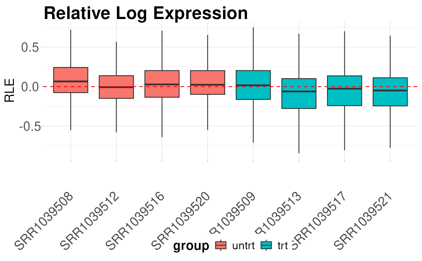
Library density plots
Library density plots show the density of reads corresponding to a particular magnitude of counts. Shifts of these curves should align with group differences and generally samples from the same group should have overlapping density curves
plot_density(logcounts, metadata = y$samples, colBy = "group") +
  labs(title = "Library Densities",
       x = "logCPM",
       y = "Density",
       color = "Treatment Group")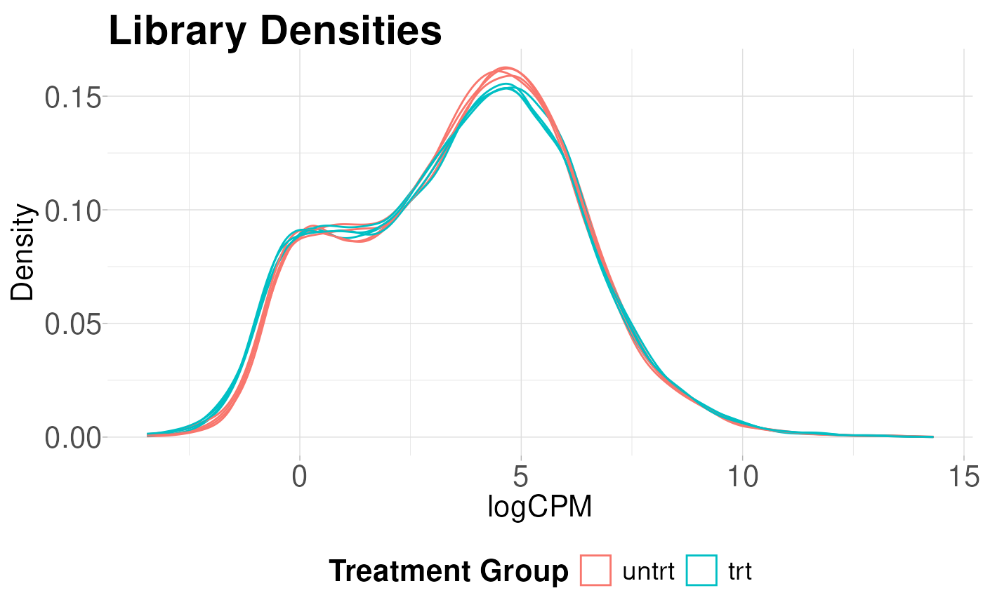
Sample vs Sample Distances
We can also calculate the euclidean distance between all pairs of samples and display this on a heatmap. Again, samples from the same group should show smaller distances than sample pairs from differing groups.
plot_dist(logcounts, metadata = y$samples[, "group", drop = FALSE])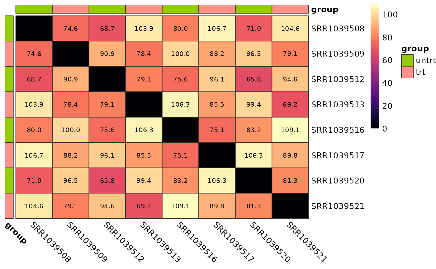
Parallel coordinates plot
Parallel coordinates plots are useful for giving you an idea of how the most variable genes change between treatment groups. These plots show the expression of each gene as a line on the y-axis traced between samples on the x-axis.
plot_parallel(logcounts, y$samples, colBy = "group",
              removeVar = 0.9, alpha = 0.05) +
  labs(title = "10% Most Variable Genes",
       x = "Sample",
       y = "logCPM",
       color = "Treatment Group")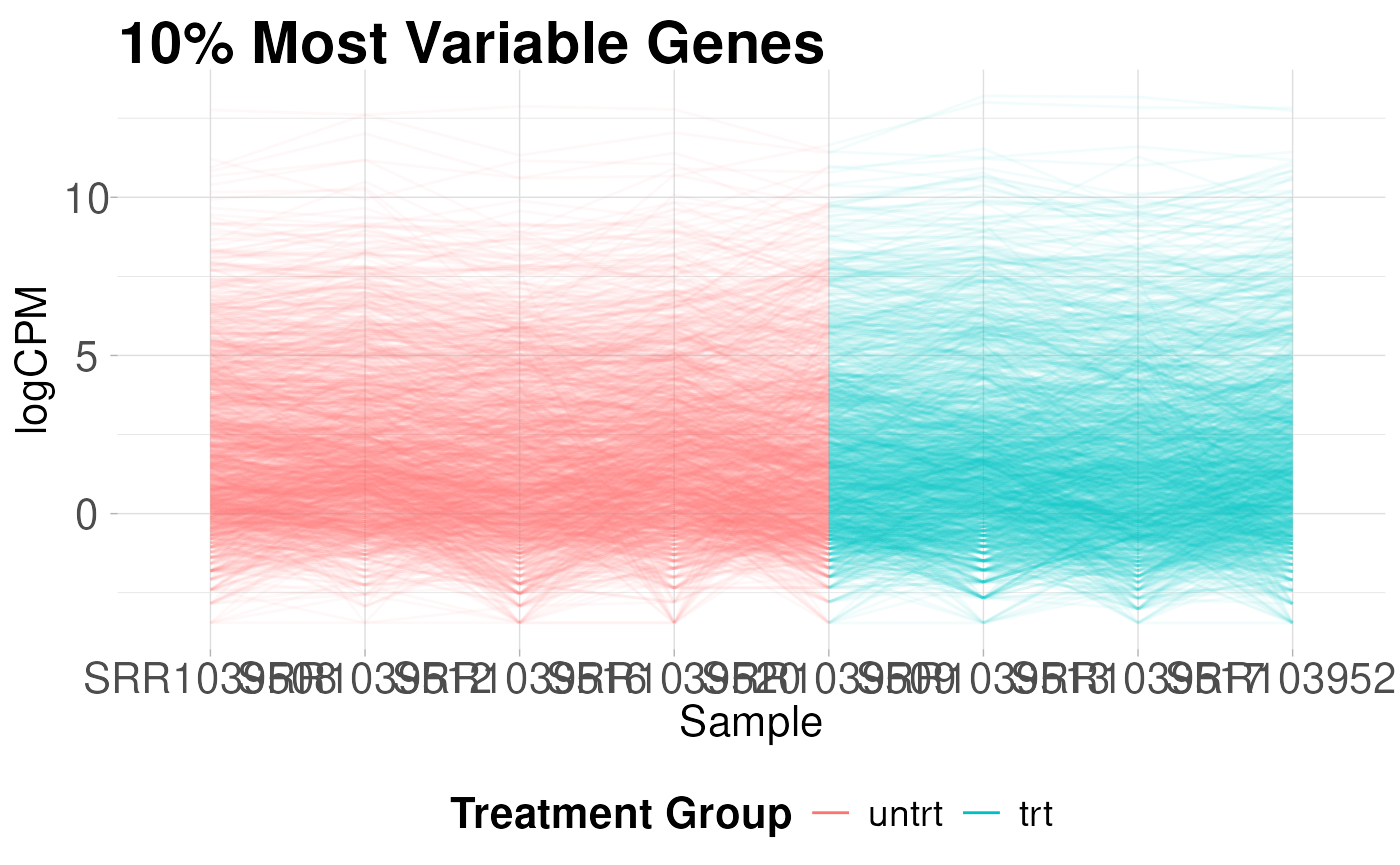
Correlations between samples
We can also plot the pairwise correlations between all samples. These plots can be useful for identifying technical replicates that deviate from the group
plot_cor_pairs(logcounts, cex_labels = 1)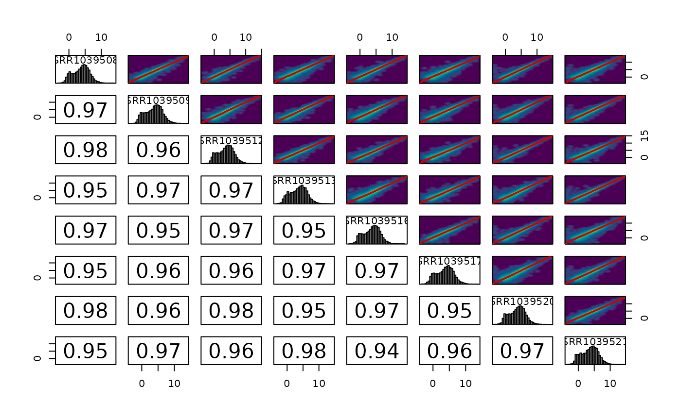
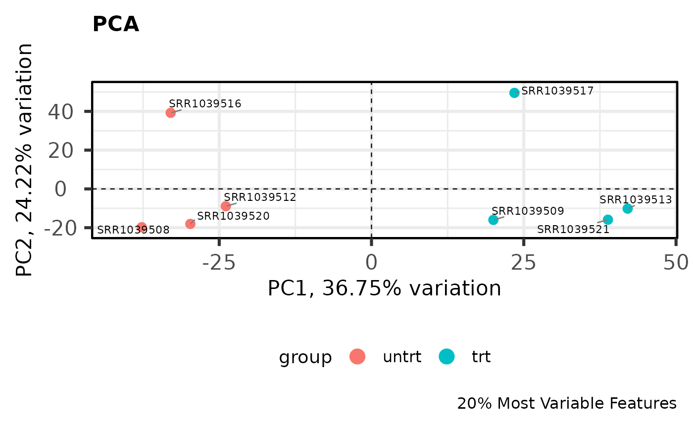
PCA
Principal components analysis is an unsupervised method for reducing the dimensionality of a dataset while maintaining its fundamental structure. PCA biplots can be used to examine sample groupings following PCA. These biplots can reveal overall patterns of expression as well as potential problematic samples prior to downstream analysis. For simple analyses we expect to see the ‘main’ effect primarily along the first component.
I like to use the PCAtools package for quickly computing and plotting principal components. For more complicated experiments I have also found UMAP (see coriell::UMAP()) to be useful for dimensionality reduction (although using UMAP is not without its problems for biologists).
library(PCAtools)


# Perform PCA on the 20% most variable genes
# Center and scale the variable after selecting most variable
pca_result <- pca(
  logcounts,
  metadata = y$samples,
  center = TRUE,
  scale = TRUE,
  removeVar = 0.8
  )

# Show the PCA biplot
biplot(
  pca_result,
  colby = "group",
  hline = 0,
  vline = 0,
  hlineType = 2,
  vlineType = 2,
  legendPosition = "bottom",
  title = "PCA",
  caption = "20% Most Variable Features"
  )
Assessing global scaling normalization assumptions
Most downstream differential expression testing methods apply a global scaling normalization factor to each library prior to DE testing. Applying these normalization factors when there are global expression differences can lead to spurious results. In typical experiments this is usually not a problem but when dealing with cancer or epigenetic drug treatment this can actually lead to many problems if not identified.
In order to identify potential violations of global scaling normalization I use the quantro R package. quantro uses two data driven approaches to assess the appropriateness of global scaling normalization. The first involves testing if the medians of the distributions differ between groups. These differences could indicate technical or real biological variation. The second test assesses the ratio of between group variability to within group variability using a permutation test similar to an ANOVA. If this value is large, it suggests global adjustment methods might not be appropriate.
library(quantro)


# Initialize multiple (8) cores for permutation testing
doParallel::registerDoParallel(cores = 8)

# Compute the qstat on the filtered libraries
qtest <- quantro(y$counts, groupFactor = y$samples$group, B = 500)
Now we can assess the results. We can use anova() to test for differences in medians across groups. Here, they do not significantly differ.
anova(qtest)

#> Analysis of Variance Table
#>
#> Response: objectMedians
#>             Df  Sum Sq Mean Sq F value Pr(>F)
#> groupFactor  1  1984.5  1984.5  0.3813 0.5596
#> Residuals    6 31225.5  5204.3
We can also plot the results of the permutation test to see the between:within group ratios. Again, there are no large differences in this dataset suggesting that global scaling normalization such as TMM is appropriate.
quantroPlot(qtest)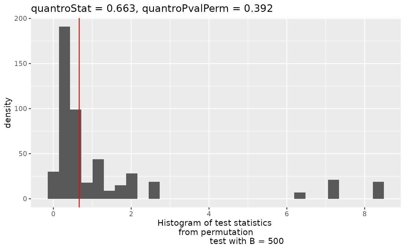
Differential expression testing with edgeR
After removing lowly expressed features and checking the assumptions of normalization we can perform downstream differential expression testing with edgeR. The edgeR manual contains a detailed explanation of all steps involved in differential expression testing.
In short, we need to specify the experimental design, estimate normalization factors, fit the models, and perform DE testing.
Creating the experimental design
Maybe the most important step in DE analysis is properly constructing a design matrix. The details of design matrices are outside of the scope of this tutorial but a good overview can be found here. Generally, your samples will fall nicely into several well defined groups, facilitating the use of a design matrix without an intercept e.g. design ~ model.matrix(~0 + group, …). This kind of design matrix makes it relatively simple to construct contrasts that describe exactly what pairs of groups you want to compare.
Since this example experiment is simply comparing treatments to control samples we can model the differences in means by using a model with an intercept where the intercept is the mean of the control samples and the 2nd coefficient represents the differences in the treatment group.
# Model with intercept
design <- model.matrix(~group, data = y$samples)
We can make an equivalent model and test without an intercept like so:
# A means model
design_no_intercept <- model.matrix(~0 + group, data = y$samples)

# Construct contrasts to test the difference in means between the groups
cm <- makeContrasts(
  Treatment_vs_Control = grouptrt - groupuntrt,
  levels = design_no_intercept
)
The choice of which design is up to you. I typically use whatever is clearer for the experiment at hand. In this case, that is the model with an intercept.
Estimating normalization factors
We use edgeR to calculate trimmed mean of the M-value (TMM) normalization factors for each library.
# Estimate TMM normalization factors
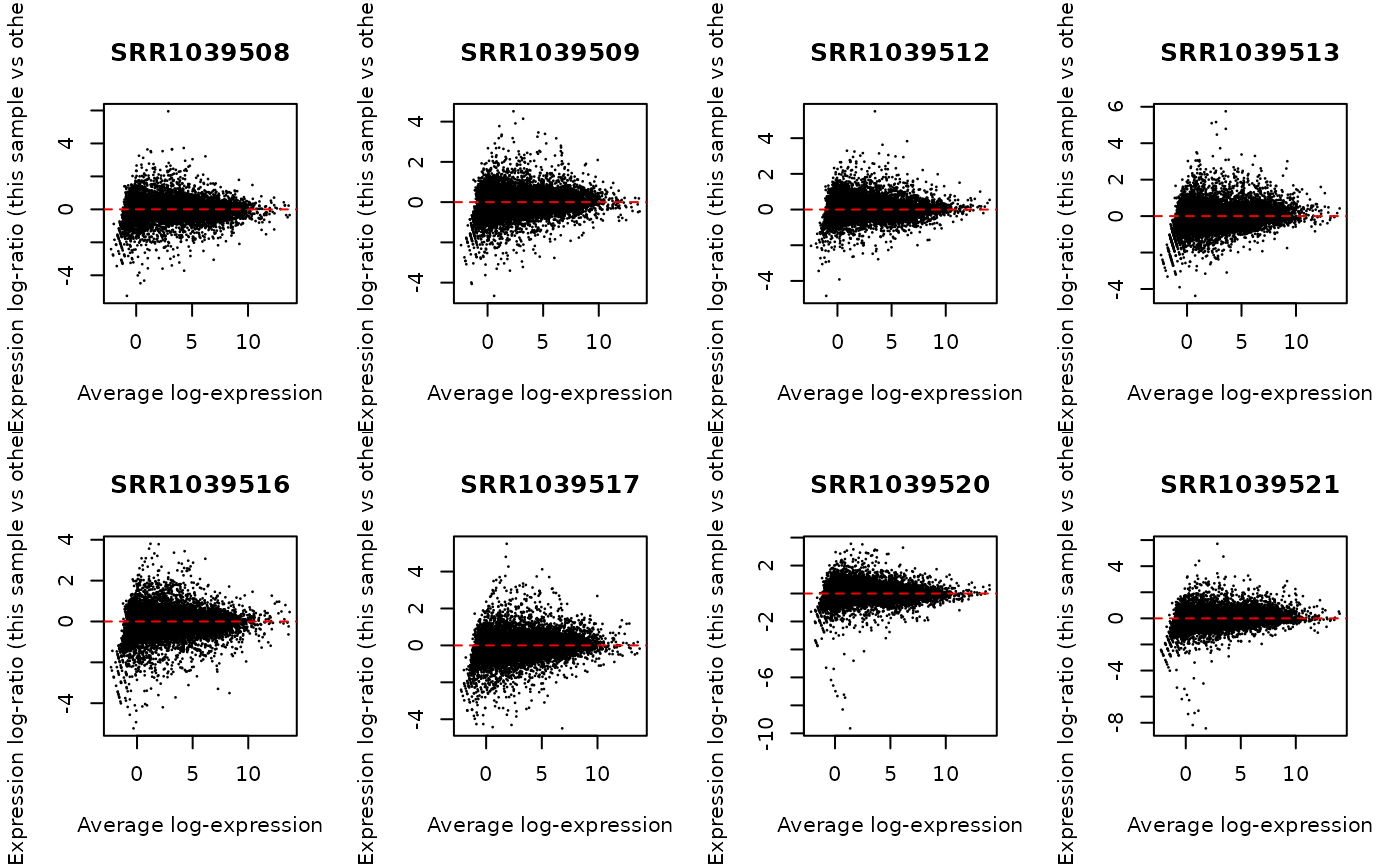
y <- normLibSizes(y)We can check the normalization by creating MA plots for each library. The bulk of the data should be centered on zero without any obvious differences in the logFC as a function of average abundance.
par(mfrow = c(2, 4))
for (i in 1:ncol(y)) {
  plotMD(cpm(y, log = TRUE), column = i)
  abline(h = 0, lty = 2, col = "red2")
}
What to do if global scaling normalization is violated?
Above I described testing for violations of global scaling normalization. So what should we do if these assumptions are violated and we don’t have a good set of control genes or spike-ins etc.?
If we believe that the differences we are observing are due to true biological phenomena (this is a big assumption) then we can try to apply a method such as smooth quantile normalization to the data using the qsmooth package.
Below I will show how to apply qsmooth to our filtered counts and then calculate offsets to be used in downstream DE analysis with edgeR. Please note this is not a benchmarked or ‘official’ workflow just a method that I have implemented based on reading forums and github issues.
library(qsmooth)


# Compute the smooth quantile factors
qs <- qsmooth(y$counts, group_factor = y$samples$group)

# Extract the qsmooth transformed data
qsd <- qsmoothData(qs)

# Calculate offsets to be used by edgeR in place of norm.factors
# Offsets are on the natural log scale. Add a small offset to avoid
# taking logs of zero
offset <- log(y$counts + 0.1) - log(qsd + 0.1)

# Scale the offsets for internal usage by the DGEList object
# Now the object is ready for downstream analysis
y <- scaleOffset(y, offset = offset)

# To create logCPM values with the new norm factors use
lcpm <- cpm(y, offset = y$offset, log = TRUE)
Fit the model
New in edgeR 4.0 is the ability to estimate dispersions while performing the model fitting step. I typically tend to ‘robustify’ the fit to outliers. Below I will perform dispersion estimation in legacy mode so that we can use competitive gene set testing later. If we want to use the new workflow we can use the following:
# edgeR 4.0 workflow
fit <- glmQLFit(y, design, legacy = FALSE, robust = TRUE)
Test for differential expression
Now that the models have been fit we can test for differential expression.
# Test the treatment vs control condition
qlf <- glmQLFTest(fit, coef = 2)
Often it is more biologically relevant to give more weight to higher fold changes. This can be achieved using glmTreat(). NOTE do not use glmQLFTest() and then filter by fold-change - you destroy the FDR correction!
When testing against a fold-change we can use relatively modest values since the fold-change must exceed this threshold before being considered for significance. Values such as log2(1.2) or log2(1.5) work well in practice.
trt_vs_control_fc <- glmTreat(fit, coef = 2, lfc = log2(1.2))In any case, the results of the differential expression test can be extracted to a data.frame for downstream plotting with coriell::edger_to_df(). This function simply returns a data.frame of all results from the differential expression object in the same order as y. (i.e. topTags(…, n=Inf, sort.by=“none”))
de_result <- edger_to_df(qlf)Plotting DE results
The two most common plots for differential expression analysis results are the volcano plot and the MA plot. Volcano plots display the negative log10 of the significance value on the y-axis vs the log2 fold-change on the x-axis. MA plots show the average expression of the gene on the x-axis vs the log2 fold-change of the gene on the y-axis. The coriell package includes functions for producing both.
library(patchwork)


# Create a volcano plot of the results
v <- plot_volcano(de_result, fdr = 0.05)

# Create and MA plot of the results
m <- plot_md(de_result, fdr = 0.05)

# Patch both plots together
(v | m) +
  plot_annotation(title = "Treatment vs. Control") &
  theme_coriell()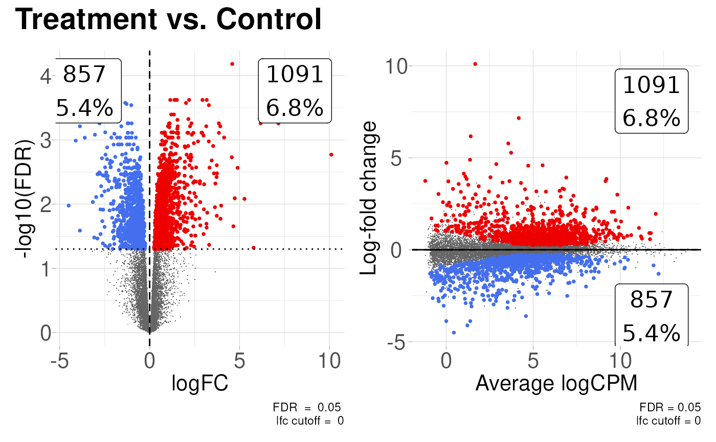
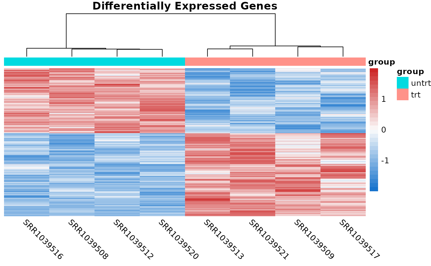
The coriell package also has a function for quickly producing heatmaps with nice defaults for RNA-seq. Sometimes it’s useful to show the heatmaps of the DE genes.
# Compute logCPM values after normalization
lcpm <- cpm(y, log = TRUE)

# Determine which of the genes in the result were differentially expressed
is_de <- de_result$FDR < 0.05

# Produce a heatmap from the DE genes
quickmap(
  x = lcpm[is_de, ],
  metadata = y$samples[, "group", drop = FALSE],
  main = "Differentially Expressed Genes"
  )